Is There Something Wrong With The Way Our Money Is Designed?
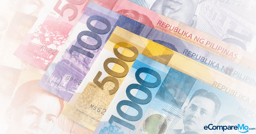
3 min readIf you’ve found yourself confused between 1,000- and 100-peso bills, you’re not alone.

The Bangko Sentral ng Pilipinas’s (BSP) New Design Series memorandum will take effect next year. That means starting January 1, 2016, you can no longer use the series of banknotes released in 1985 for your purchases. You may, however, have them exchanged with the new series at banks and authorized BSP establishments until January 2017.
We have more than a year to finally let go of old bills. That can be a bit of a relief, especially for people who claim to have been victimized by the confusing colors of our currency. In a report that appeared in the Philippine Daily Inquirer in May, Senator Aquilino Pimentel noted that his office received complaints about the 100- and 1,000-peso bills looking too similar, which could cause confusion among the public. Similarly, Reddit user shares: “I’ve had friends tell me they drunkenly paid cabbies with a thousand instead of a hundred. I have to agree that the similarity between 20 and 50, and 100 and 1,000 [peso bills] is a bit silly.”
Some people refute this, pointing to US dollar banknotes, which are all made in hues of green. “I don’t get why they’re complaining about the colors [of Philippine pesos],†notes user DiscoDread in the same Reddit thread in Filipino. “Maybe it’s about time we paid full attention to the numbers on the bills.â€
If not the colors, what about the way Philippine banknotes are designed causes confusion among people, even sober ones? And if there really is a design flaw, how can it be fixed?
See related topic: (6 Ways Criminals Will Try To Steal Your Money During The Holidays)
More than meets the eye
The New Generation Currency (NGC) series that will be exclusively in circulation starting next year was released in 2010. It’s meant to replace the New Design Series (NDS), which has seen 30 years of use and abuse in peso-related transactions.
On the surface, the bills underwent a nice major facelift: The NGC series highlights more of Filipino culture, including tourist spots, heritage items, and commemorative events.
“Designing a bank note is not an easy task,†says Jaykee Evangelista, 40, an art director who has worked with a number of magazines and advertisers. “Our bills could use less of the elements, which should make it easy for us to distinguish bills from one another. Yes, the colors play a big part, but so do the elements. And we have to do this without sacrificing the security features.â€
It’s true: while people may see only the changes in its design, there actually are security features that come with the peso bill overhaul.
The new bills are now equipped with an optically variable device—an iridescent image that changes color whenever you view the money from different angles. Other anti-counterfeit features, like specks of fluorescent fiber that react to black light, have also been added.
 See related topic: (4 Money Habits Millennials Need To Learn From Previous Generations)
Material things
There are technical limitations that make it difficult for the BSP to create more distinct colors for some currencies, especially between the 20- (orange) and 50 peso (red) denominations, and 100 (purple) and 1,000 (blue) peso denominations.
“While specialized machines for printing money can imprint security features on our banknotes, it has limited capability for printing colors, unlike machines used to print magazines and books,†the BSP said in a statement. “This is not an error but a function of printing capability limitation.â€
Color, printing capabilities, and security aside, another major consideration is the type of paper used. “Because money changes hands frequently, it has to survive the exchange,†says Evangelista.
Other countries use waterproof, plastic banknotes, while the Philippines’ NGC series is made of 30-percent abaca fiber. This is not only done to support abaca production in the country, but also to discourage counterfeiters due to the limited supply of the native material.
“The design of a bill also serves as a branding tool,†adds Evangelista. “It is free advertising for the country. So we might as well make it effective and really good to look at and spend.â€
It will take several years before the BSP issues a new design for the Philippine peso. For now, our advice is for you to take extra care in handling this widely circulated piece of art. Pay more attention to the number than the color when using cash for your transactions. As for handing money to cab drivers while drunk—we really can’t do much about that, can we? –Dino Mari Testa
