Did Metro Manila Traffic Get Better Or Worse? Let Uber’s Data Answer Our Questions
4 min readIn 2016, Metropolitan Manila Development Authority (MMDA) General Manager Tim Orbos boasted that the agency’s efforts had reduced the congestion on the capital’s busiest thoroughfare. According to the MMDA chief, travel time from Monumento in Caloocan City to Roxas Boulevard in Pasay City via EDSA was reduced by ten minutes.
While the government is proud of its achievement, the people who subject themselves to traveling this route daily would beg to differ.
But is there a grain of truth to what the government is saying? Well, data doesn’t lie, and Uber has just released a treasure trove of data that it has collected on travel times of their drivers over the past few years of its operation in the country. With the help of Uber Movement, we can see just how travel time has changed and if there really is an improvement at all.
Free data for all
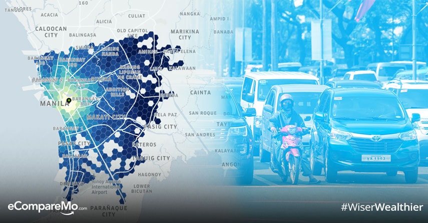
Uber Movement is the ridesharing company’s efforts to use data as means to improve the traffic situation. The project opens up the data it collected through customer usage of the platform to give people a peek on how long it takes to get from one place to another. While everyone can use Uber Movement, the company intends it to be used by urban planners and policymakers to decongest cities and make city less nightmarish.
“Over the past six and a half years, we’ve learned a lot about the future of urban mobility and what it means for cities and the people who live in them. We’ve gotten consistent feedback from cities we partner with that access to our aggregated data will inform decisions about how to adapt existing infrastructure and invest in future solutions to make our cities more efficient,†Uber said in its Movement website.
(Read: Surviving Carmaggedon: A Guide To Keeping Cool On the Road)
Despite the number of data privacy issues involving Uber, the company assured the public that the data used in Movement is anonymized and aggregated to prevent anyone from being identified using the tool. In addition, the company promised that no one can “access individual driver or rider details in any way, shape or form.â€
Now that we’re off to a good start, it’s time to take Uber Movement for a spin and get some meaningful insights regarding Metro Manila traffic.
Change has come
With Uber Movement, users can track how certain events on a particular day can affect traffic congestion around the area. For instance, using the tool, you can see the increase of travel time from Welcome Rotonda to De La Salle University on Taft Avenue between summer vacation and school season. These tidbits will give you insight on how traffic moves during certain times of day, which times are the most optimal to get from one place to another, and how certain events like a nearby accident or a train breakdown can alter travel time.
To know how vehicular flow has changed over time, we picked a few samples within Metro Manila. The two routes we will use on Uber Movement are the following, comparing the average monthly travel times between 2016 and 2017:
- Ermita, City of Manila – Ayala Avenue, Makati City
- Kamuning, Quezon City – Edsa corner Roxas Boulevard, Pasay City
Ermita, City of Manila – Ayala Avenue, Makati City
| Month | Average Mean of Travel Time | Least Amount of Travel Time | Highest Amount of Travel Time |
|---|---|---|---|
|
January 2016 |
00:45:04 |
00:25:58 |
01:18:12 |
|
February 2016 |
00:38:02 |
00:25:25 |
00:56:54 |
|
March 2016 |
00:37:05 |
00:25:14 |
00:54:29 |
|
April 2016 |
00:33:47 |
00:24:03 |
00:47:27 |
|
May 2016 |
00:35:38 |
00:25:02 |
00:50:41 |
|
June 2016 |
00:41:25 |
00:28:06 |
01:01:02 |
|
July 2016 |
00:39:58 |
00:27:13 |
00:58:40 |
|
August 2016 |
00:42:25 |
00:29:21 |
01:01:16 |
|
September 2016 |
00:42:35 |
00:29:05 |
01:02:20 |
|
October 2016 |
00:42:35 |
00:30:09 |
01:04:26 |
|
November 2016 |
00:43:02 |
00:30:42 |
01:00:19 |
|
December 2016 |
00:41:24 |
00:27:46 |
00:27:46 |
|
January 2017 |
00:40:29 |
00:28:01 |
00:58:29 |
|
February 2017 |
00:39:43 |
00:27:16 |
00:57:50 |
|
March 2017 |
00:39:12 |
00:26:54 |
00:57:06 |
|
April 2017 |
00:37:35 |
00:25:47 |
00:54:45 |
|
May 2017 |
00:40:04 |
00:27:06 |
00:59:12 |
|
June 2017 |
00:43:55 |
00:30:28 |
01:03:18 |
|
July 2017 |
00:40:01 |
00:27:31 |
00:58:11 |
|
August 2017 |
00:37:58 |
00:26:39 |
00:54:04 |
|
September 2017 |
00:41:07 |
00:28:24 |
00:59:31 |
|
October 2017 |
00:42:34 |
00:28:37 |
01:03:18 |
|
November 2017 |
Data currently unavailable |
Data currently unavailable |
Data currently unavailable |
|
December 2017 |
Data currently unavailable |
Data currently unavailable |
Data currently unavailable |
(Read: Waze Tags Philippine Roads As World’s Worst – Again)Â
Kamuning, Quezon City – Edsa corner Roxas Boulevard, Pasay City
| Month | Average Mean of Travel Time | Least Amount of Travel Time | Highest Amount of Travel Time |
|---|---|---|---|
|
January 2016 |
00:57:57 |
00:35:18 |
01:35:07 |
|
February 2016 |
00:54:59 |
00:37:51 |
01:19:52 |
|
March 2016 |
01:00:27 |
00:43:49 |
01:23:23 |
|
April 2016 |
00:50:27 |
00:36:47 |
01:09:10 |
|
May 2016 |
00:49:01 |
00:36:01 |
01:06:40 |
|
June 2016 |
00:56:47 |
00:41:08 |
01:18:22 |
|
July 2016 |
00:55:42 |
00:39:26 |
01:18:39 |
|
August 2016 |
01:03:41 |
00:45:35 |
01:28:57 |
|
September 2016 |
00:57:50 |
00:41:46 |
01:20:03 |
|
October 2016 |
00:55:41 |
00:55:41 |
01:21:13 |
|
November 2016 |
00:56:33 |
00:37:43 |
01:24:46 |
|
December 2016 |
00:57:06 |
00:37:26 |
01:27:04 |
|
January 2017 |
00:48:18 |
00:34:17 |
01:08:02 |
|
February 2017 |
00:48:13 |
00:33:42 |
01:08:57 |
|
March 2017 |
00:50:37 |
00:35:19 |
01:12:30 |
|
April 2017 |
00:49:38 |
00:34:45 |
01:10:52 |
|
May 2017 |
00:49:20 |
00:35:20 |
01:08:52 |
|
June 2017 |
00:54:45 |
00:38:29 |
01:17:52 |
|
July 2017 |
00:47:26 |
00:33:37 |
01:06:55 |
|
August 2017 |
00:46:25 |
00:33:03 |
01:05:10 |
|
September 2017 |
00:55:25 |
00:38:33 |
01:19:38 |
|
October 2017 |
00:52:05 |
00:35:55 |
01:15:30 |
|
November 2017 |
Data currently unavailable |
Data currently unavailable |
Data currently unavailable |
|
December 2017 |
Data currently unavailable |
Data currently unavailable |
Data currently unavailable |
Based on the following data from Uber Movement, travel time from Ermita to Ayala was shorter in 2016 from February to July. Meanwhile, 2017 showed improvements for the months of January, August, September, and October. While both years exhibited good monthly average times of travel, the difference wasn’t really substantial. The biggest time difference between the two years didn’t exceed five minutes.
While the Ayala-Ermita route showed mixed results, the Kamuning-Roxas Boulevard did show some improvements in 2017. Â Except for the month of May (and November and December because data for those months are still not available), commuting from Kamuning Street to Edsa corner Roxas Boulevard was much better last year than 2016. On March, the difference between the two years even reached ten minutes.
So, what’s the takeaway here? Honestly, not much for individuals, since Movement doesn’t show real-time data of traffic right now. While it can give you some insight, the data you’ll get is historical and what you’re getting from past information may or may not be applicable today. If you’ve got time to spare, this is a fun tool to play with.
However, at the hands of data nuts and policymakers, commute patterns can help our urban planners, politicians, and other entities involved in creating the infrastructure to know which places are in dire need of support. Who knows, the next solution to Metro Manila’s traffic decongestion could be data-driven.
Sources: Uber Movement, Engadget, Wired
About the author
eCompareMo eCompareMo is the No. 1 financial e-commerce site in the Philippines. Follow us on Twitter and Instagram: @ecomparemo.